Joyful Honey
Brand creation for a white-label honey product
The Client
For the Hive Supply Company retail brand, this subbrand was created specifically for this product line.
The Challenge
Creating a new brand that targets a specific honey-loving audience while fitting in the Hive Supply Co brand architecture to leverage both brands.
The Strategy
In creating a brand for a commodity like honey, we needed to bring it to life to stand out. By focusing on personifying the product and making a direct connection to its local region we created a brand that is unique and intriguing.
The Design
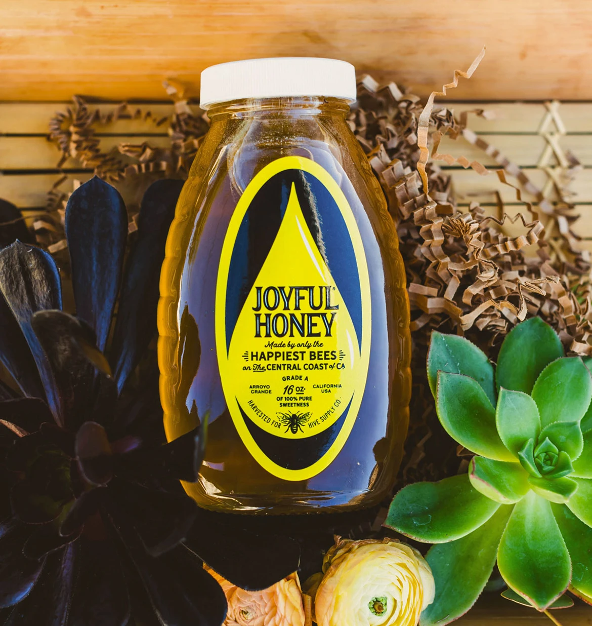
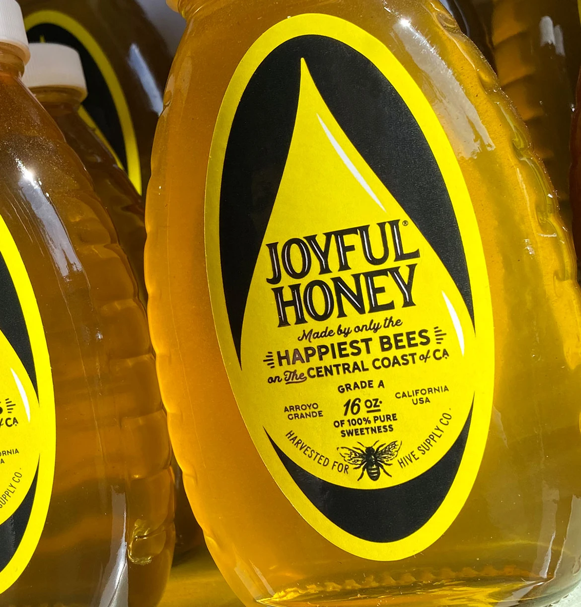
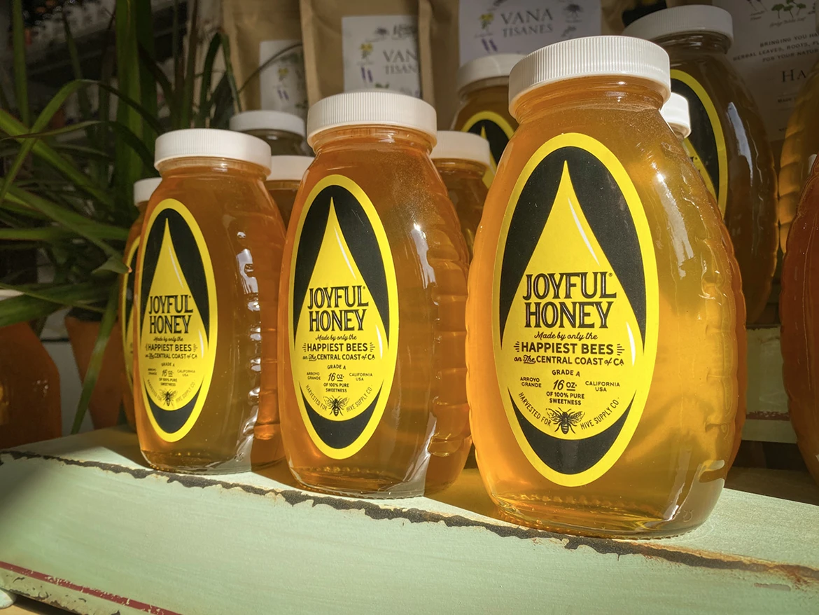
Since we knew the initial and main context of the brand, the glass honey jar, we took this into consideration when designing the brand identity. By allowing the logo to be a simple wordmark with minor texture we empowered the label to have more style and influence on the visuals which reinforces the brand’s strategy.
The Creative Solution*
A brand identity design personifies the honey by bringing emotion, joy, to the honey. This shines light on the bees being from San Luis Obispo (Known as the happiest city in America thanks to Oprah) — this not only localizes the bees but humanizes the product to make it more relatable and appealing. The design is intriguing by using the shape of the actual label to help visually form the droplet of honey — both elements help the viewer make the connection with honey.
The Results
An appealing white-label brand that stands out from other products and reinforces the brand of its umbrella company while advocating its own sales.
*Learn more why our solutions drive results.