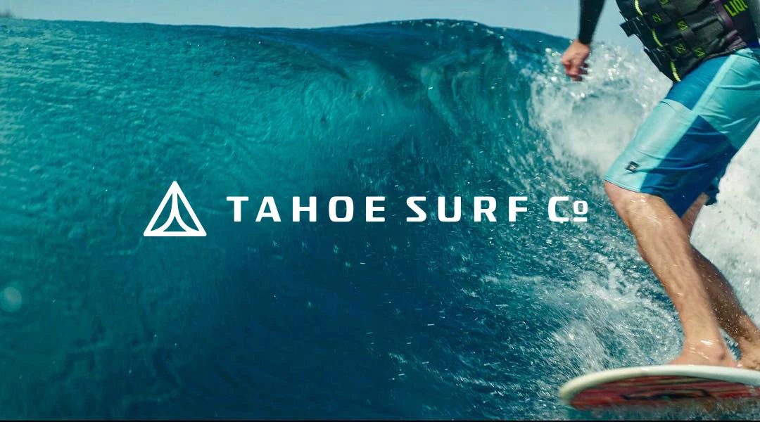
Tahoe Surf Co.
Rejuvenating an existing brand into a relevant lifestyle brand that can scale.
The Client
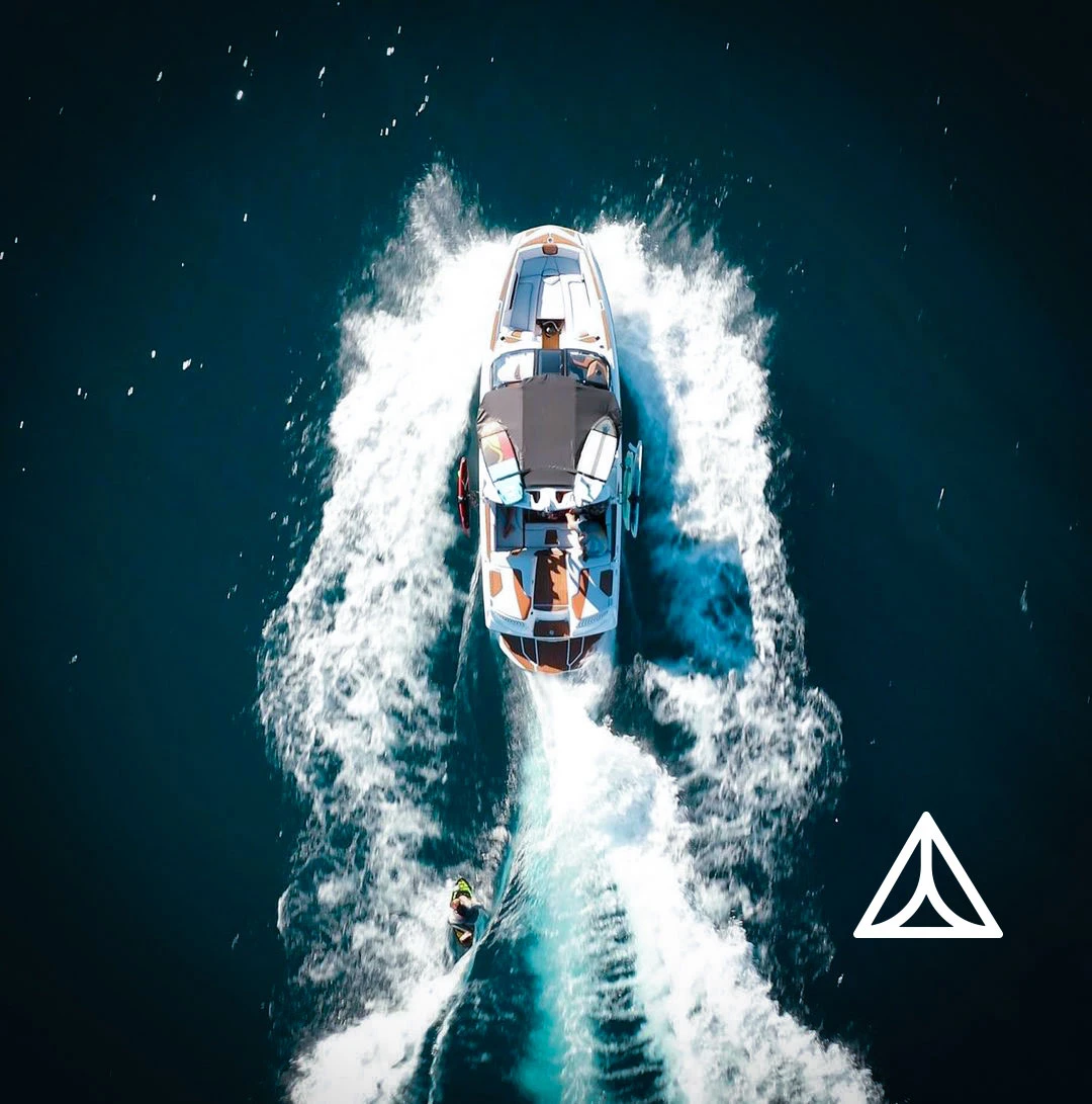
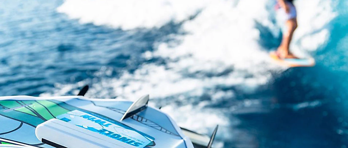
A surf brand located in the Sierra Nevada Mountains who focuses on creating surf experiences of endless waves right on Lake Tahoe.
The Challenge
After several years of doing business, the existing brand needed to evolve to refine its market position in tandem with its brand identity and strategy.
The Strategy
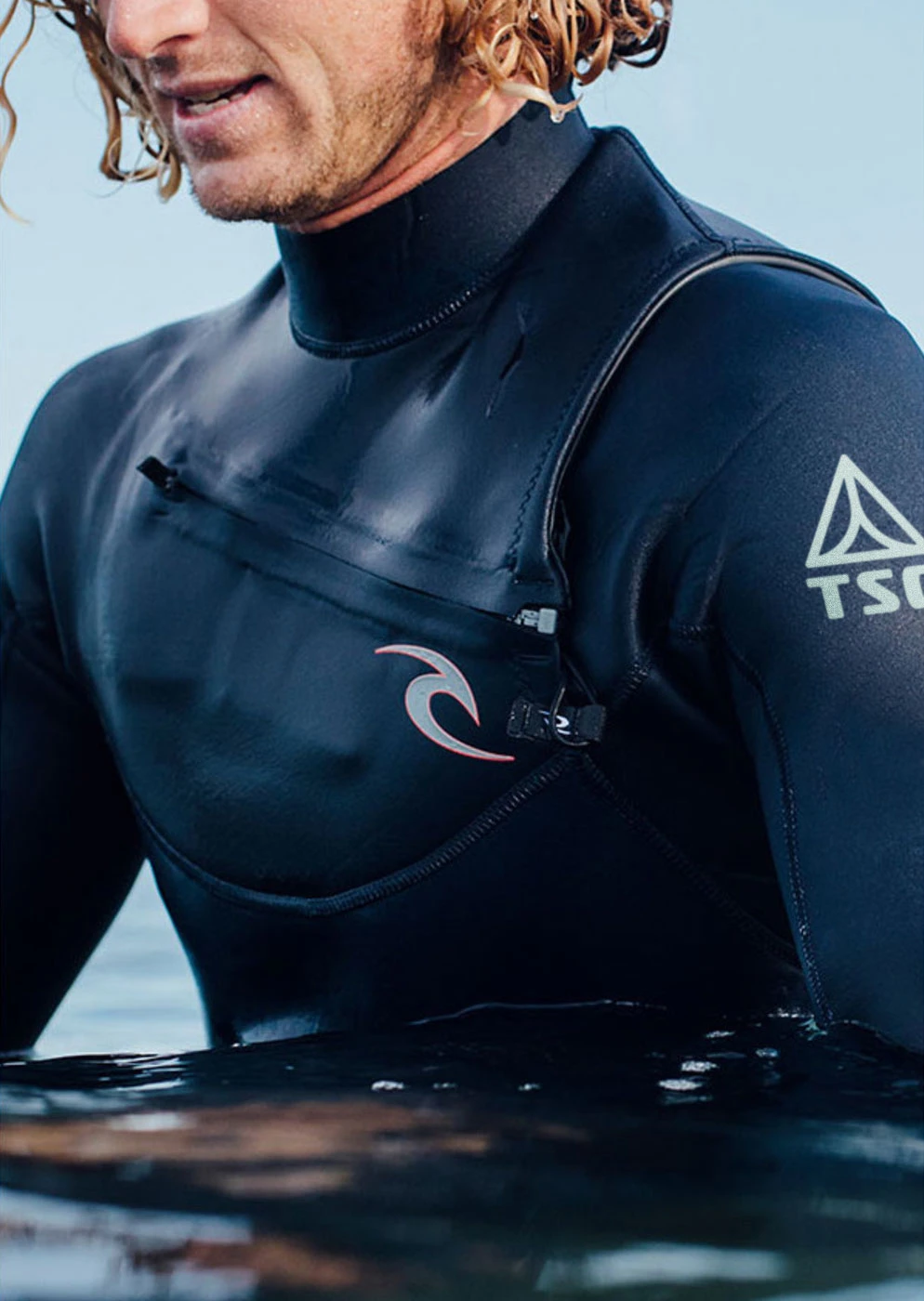
The brand strategy focused on not only offering very professional board sport aesthetics but still being accessible and not intimidating to those who may not be as high caliber in their surfing skillset.
The Design
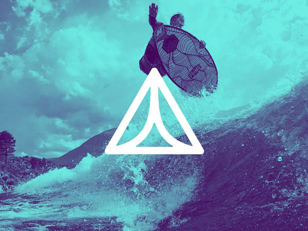
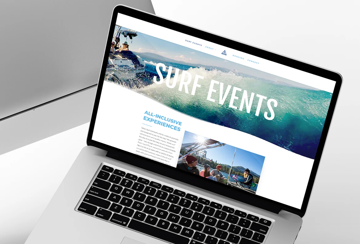
The brand’s identity from logo to web and merchandise needed to be refreshing, fun, and have plenty of energy. The design needed directional angles accompanied by a fresh color palette and a scalable icon. These elements would help accomplish the brand strategy and build towards the business objectives.
The Creative Solution*
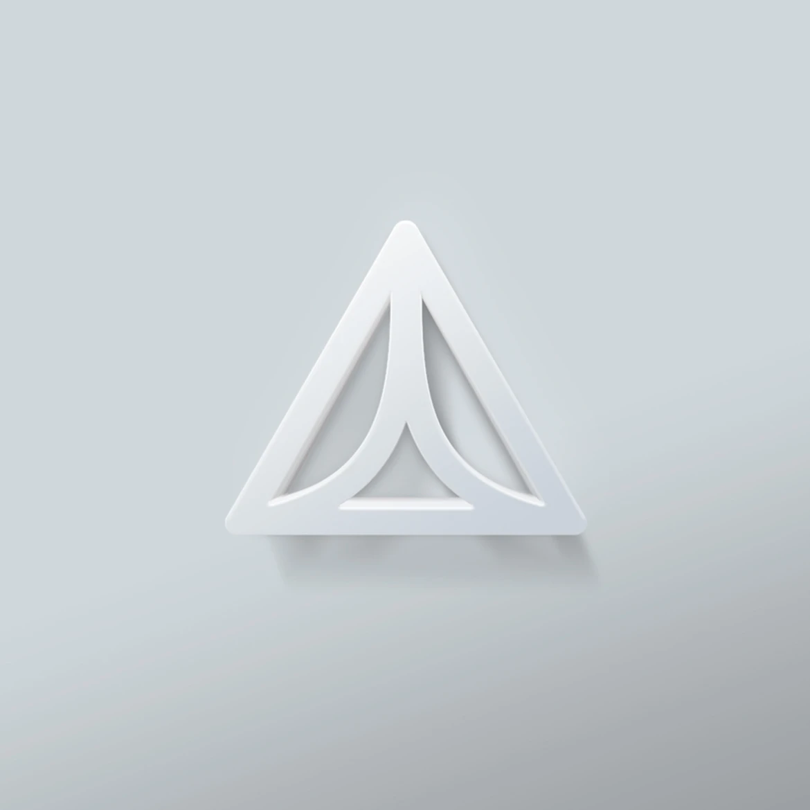
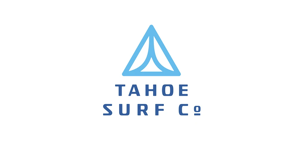
Appealing to both the high-end professionals and those who are just beginning through a brand that relates by connecting the identity concept to the activity as well as the lifestyle Tahoe Surf Company represents. The logo is agile yet still human and welcoming. The mark represents an aerial view of the wake the boat makes, while also being a minimal icon that is scalable and memorable.
The Results
A cohesive brand that connects to the board sport audience and stands out from the competition.
*Learn more why our solutions drive results.